Above: Woman at Gonghe Horse Festival, Amdo, by Jean-Claude Louis.
Above: Holi Festival in India. Bright pigments are tossed everywhere as part of the celebration.
Wild and vibrant, pink can also be as subtle and ethereal as the inside of a shell...
Above: Found on a quiet beach in Baja Mexico.
Above: Christopher Wool, "Untitled", 2005. Wool is represented by Luhring Augustine Gallery.
Above: From House Beautiful, this is painted in Valspar's Paris Pink.
Above: From a beautifully designed Penguin series of tiny books with commissioned illustrations, "English Ballet" by Jane Leeper, 1945.
Pink has always been a symbol of femininity...
Above: Frida Kahlo with pink flowers in her hair.
Above: Photo by Vogue photographer Frances McLaughlin Gill, 1948.
Above: John Graham, "Profile and Hat", 1942 at the Renwick Gallery, Smithsonian Museum. John Graham, originally named Ivan Dombrowski, was born in Warsaw. He was 34 years old when he came to New York in 1920. He has a colorful history, exaggerating his aristocratic connections, and influencing such artists as Arshile Gorky, Jackson Pollock and Willem de Kooning. You can read more about John Graham here.
Delicate and ephemeral....
From Domino magazine Jan/Feb 2006 Photo by Mikkel Vang/Styling Christine Rudolph. The black centers give depth to the pale petals.
Above: At Dosa, Cotton and silk clothing colored in delicate seashell pinks. Christina Kim of Dosa told me that the color comes from washing whites together with "sadhu" cloth. This is the orange cloth the sahdus of India wear to signify their renunciation of the world around them.
Above: Colors for a painting of this coral.
Above: I photographed this piece at a Claremont Graduate University MFA open studio show last spring. The artist is Thinh Nguyen.
Above: Do-Ho Suh, "Staircase" 2003.
Faded pink set off with brown...
Above: The Serpentine Dance, recorded by the Lumiere Brothers in 1896 of dancer Loie Fuller. It was hand tinted frame by frame, and released in 1899. It's amazing to see the way she moves the fabric around her.
Above: Henri Matisse (1869-1954), "The Rose Marble Table"1917. This piece was included in the recent exhibition at the Museum of Modern Art, "Matisse: Radical Invention, 1913-1917".
Above: Edouard Manet, "Branches de Pivoines Blanches et Secateur", 1864, from the Musee D'Orsay. Here the pink is so pale as to be almost white.
Above: In Wes Anderson's film The Royal Tenenbaums, pink could be listed as a character. The central hallway is painted a rich bubble gum pink, a wonderful backdrop for the framed children's drawings. It plays a part in every scene as pink constantly orients you when you see it through an open door. Many scenes takes place on the stairs and in the ballroom, also pink, so it is a frequent backdrop to the action. In addition Pagoda, Royal Tenenbaum's butler and companion is generally seen in a white top with bright pink pants, Royal wears a pink shirt in a number of scenes, or sometimes a pale pink bathrobe, Etheline wears a pale pink suit or a pale pink coat and Margot and Royal go for ice cream to a beautiful pale pink and mint green restaurant. Pink is woven through almost every scene in the film. The pictures here give a sense of the hallway and ballroom, though the color is darker than it appears in the film.
Above: Domino Magazine created a room inspired by The Royal Tenenbaums in their Jan/Feb 2006 issue. The paint they chose for the walls is Regal AquaPearl latex in Authentic Pink.
Above: From Elle Decor, this is the card room in the Sag Harbor home of designer Steven Gambrel. Pink is a terrific backdrop. This pink is made cool because it has a lot of blue in it.
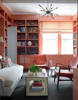
Above: This shade of pink gives a warm feeling to the room, and picks up on the most faded parts of its antique carpets. It's by homeowner and designer Christophe Gollut, from the book "Color in Decoration" by Annie Sloan and Kate Gwynn, published by Little, Brown. There are three shades of a warm pink in the room; the walls. the sofa, and the deep burgundy of the armchair, which contrasts beautifully with the blue gray woodwork.
Above: An interior by Luis Barragan using a slightly darker pink similar to the one used on the walls in the room above.
Above: From House Beautiful. Coral pink paint, (Farrow and Ball's "Red Earth"), is made modern because of the unexpected glossy finish, the solid blue gray carpet, and the furnishings.
Above: All it takes is a few pink flowers to enliven this room. (via Light Locations)
Above: A selection of pink linens. If walls in pink are too much, perhaps a sofa or drapery or a single chair might be desirable. I like linens to be pre-washed, softened. Linen takes color very well, and there are subtle unusual colors to be found.
Top Left: Pierre Frey F2480-18 Top Center: Kravet #30227-7 Top Right: Pierre Frey F2484-25 Bottom Left: Designers Guild F562-61 Bottom Center: Designers Guild #F1723-36 Bottom Right: Designers Guild #F1723-39
Above: From the book by E.A. Seguy, "Code Universel Des Couleurs". These colors when used together are joyful and full of energy.
Above: Ken Kiff, "Pink Landscape with Horse", 1992-6, from the book "Ken Kiff" published by Thames and Hudson, 2001 .
Above: Cy Twombly, "Untitled", 2001, at the Museum of Modern Art, NYC.
Above: Vanessa Bell, "View of the Pond at Charleston". Vanessa Bell and Duncan Grant leased Charleston in 1917, so this was painted sometime after that.
Above: From Domino magazine, April 2007. This shows the beauty of using two different colors of taffeta on a window.
Above: Mark Rothko (1903-1970), #3 1967
Above: Maira Kalman, "Rajastani Room", 2004-5. her work can be seen in a retrospective "Various Illuminations (of a crazy world)" currently at the Skirball Museum here in Los Angeles till February 13th. It has one more stop in the spring in NYC.
Above: In a bedroom designed by Muriel Brandolini for her daughter, from the book "Rooms to Inspire" by Annie Kelly, published by Rizzoli. The way she changes colors vertically on the wall IS quite inspiring.
Above: This photo, "Central Park Trees" by James Estrin is from the New York Times. The person walking below in a yellow historical outfit that gives the picture a focus. The last trip I took with my mom before she passed away we went to this spot, the Conservatory Garden. The photo was published on April 17 2006, just about a week after she passed away. It was a lovely thing to see.
Above: Maira Kalman, "Pink Package" 2004-5. This painting, as well as the actual package she based it on, are both in the current show. She always uses gouache. When I went to her talk at the Skirball someone asked why she used it...she said it was because it dries so fast. I think it must have something to do with the matte finish and the saturated color as well.
Above: Pink and red are so dynamic and satisfying when used together. This is from Domino magazine, October 2006. The pink wall is painted with Benjamin Moore Pink Petals #2085-60, and the red with Benjamin Moore Red Tulip #2000-30.
Above: The E.A. Seguy book includes pages with holes cut out so you can see how the colors interact.
Above: Polly Apfelbaum "Pink Crush" 2007. This is from a group show at a gallery in Mumbai, Galerie Mirchandani. The show is titled "Pink".
Above: James Turrell, "The Wolfsburg Project", 2010. This is Turrell's largest walk-through light installation.
Above: Philip Guston, "Painter's Table" 1973. Pink was a very important color to Guston...it feels as though it has a darker quality in his work.
Above: Wall in Antigua
Above: Mark Rothko (1903-1970), #16, 1960
Above: By Andrew Masullo
Above: Pygmy seahorse hiding in coral in Indonesia.
Above: Henri Matisse (1869-1954), "Palme Noir Sur Fond Rose", 1947. The dark pink is a lovely foil for the black.
Above: Siddhartha, book designed by Alvin Lustig, which uses pink, red, and black. Black really sharpens pink and makes it a more aggressive color.
Above: Irving Penn cover of Vogue July 1952
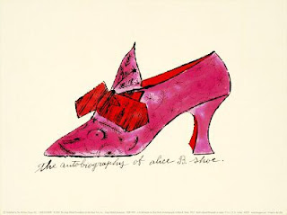
Above: Andy Warhol uses pink, red, and black in this glamorous shoe illustration. He was quite successful as a magazine and advertising illustrator before he became a fine artist.
Above: Andy Warhol, "Marilyn Monroe", 1967.
Above: The New York Dolls album cover. You can see the pink on the lips is lifted from Warhol. The shifting of balance towards black completely changes the connotation of the colors.
Above: Kay Thompson's book about Eloise, a little girl living at the Plaza hotel, where Kay Thompson lived herself. Eloise was inspired by Liza Minnelli, her god-daughter, the daughter of Judy Garland and Vincente Minnelli. Kay Thompson is also an actress in the movie Funny Face...you can see her in one of the photos from the film below.
Above and Below: Images from "Funny Face". The musical number "Think Pink" is a tribute to pink.
Kay Thompson, (author of Eloise), shown above in gray, plays Maggie Prescott. Her character is based on Harpers and Vogue Editor Diana Vreeland, who is known to have said "Pink is the navy of India". Jacqueline Kennedy kept that in mind when she visited Jaipur...
Above: Audrey Hepburn on a set, photographed by Bob Willoughby. This is the cover of a new book of his photos of Audrey Hepburn that Taschen just published.
Above: Domenico Ghirlandaio (1449-1494), "Birth of John The Baptist", 1485-1490, detail. Pink has long been a favorite color for elegant dresses.
Above: Antoine Watteau (1684-1721) "Les Deux Cousines" 1717-1718, Louvre Museum
Above: From the Metropolitan Museum of Art Costume Institute. "French Dress" 1775
Above: Jean-Honore Fragonard (1732-1806) "The Swing" 1767, the Wallace Collection.
Above: From the Metropolitan Museum of Art Costume Institute, "French Afternoon Dress", 1855.
Above: Cecil Beaton took this photo in 1952. From the book "The Party Dress" published by Rizzoli in 2007.
Above: From the Metropolitan Museum of Art Costume Institute, Alexander McQueen, "Oyster Dress" 2003.
Above: Although pink is more commonly associated with clothing there's something wonderful about seeing it used on architecture. This is a villa in Venice.
Above: The Doges Palace, Piazza San Marco, Venice, covered in pink and white marble.
Above: In Jaipur, referred to as "The Pink City" because in 1876 all the buildings were painted pink, the color of hospitality, in honor of a visit from the Prince of Wales. All buildings painted within the old city are still required to be pink. The Hawa Mahal shown here is a spectacular structure, built in 1799 to allow the ladies of the court to watch Royal processions. The pyramid shape of the Hawa Mahal gives it an appearance of the crown that adorned the head of Lord Krishna.
Above: A view of the Hawa Mahal from the back.
Above: Sunrise in Jaipur. This is a view of the Jal Mahal, or Water Palace.
Above: In Burano the houses are painted in an array of brilliant colors...I thought it might just be one street, but when I saw it in person I could see that it extends throughout the island. Burano is famous for lace making...it seems like a wonderful way to spend time; sitting in the colorful street with friends making lace and chatting.
Above: Convent Street in Peru
Above: Luis Barragan's "Cuadra San Cristobal", or Stable of Saint Cristobal, 1967-68.
Above and Below: In Santa Marta favela, a slum in Rio, two Dutch artists, Dre Urhahn and Jeroen Koolhaas, have revitalized the area through the use of paint. They worked with local youth, and Brazilian paint company Coral, to paint 34 buildings, creating a fantastically exciting environment, bringing attention to the area, and training the kids in a marketable skill.
Above: by Andrew Masullo.
Above: A group of works by Andrew Masullo
Above: At the Elephant Festival in Jaipur prizes are awarded for the most beautiful decoration.
Above: Robin Mitchell, Code Painting #12, 2006
Above: Anne Redpath, (1895-1965) "The Pink Table", 1948.
Above: Pink chairs against a robins egg blue wall, in the Santa Barbara home of Brian and Laurence Hodge, from Santa Barbara magazine.
Above: Flowers at Superica, Santa Barbara...great energy in the relation of these colors.
Above: In a room at Charleston, Vanessa Bell and Duncan Grant's home, and the gathering place for the Bloomsbury group.
Above: Willem de Kooning (1904-1997), "Pink Landscape", 1938.
Above: Windsor Smith's Living Room from House Beautiful. The walls are Pink Begonia with Decorator White trim, both from Benjamin Moore.
Above: Henri Matisse (1869-1954), "Still Life with Lemons", 1943, Museum of Modern Art.
Above: Fashion designer Liza Bruce's Residence in Jaipur.
Above: At a beach in the Yucatan, the water is actually pink. (via The Selby)
Above: Paul Gaugin, (1848-1903) "Riders on the Beach", 1902
Above: A digitally altered photo of the San Fernando Valley by Florian Maier-Aichen ,"Untitled", 2004.
Above: A flower arrangement made by at The Little Flower School, in Brooklyn. I'd love to take lessons there myself.
Above: Photo and writing by Maira Kalman from her NY Times blog, "The Pursuit of Happiness". Her delight in the world is contagious...it's a pleasure to see the world through her eyes.
Above: A favorite drawing of mine, made by my daughter when she was little.


Every time you put up a post, I think that's the most beautiful one yet. I love Pink!
ReplyDeletefantastic! gorgeous! poetic!
ReplyDeleteIt is such a pleasure to see the world through YOUR eyes, Laura! Beautiful, beautiful... once again.
ReplyDeleteI have never been a fan of pink, in fact it may have been my least favorite color, until today. Wow, Laura this is just beautiful! Susan
ReplyDeleteI'm a pink freak! Laura i LOVE this.Thank you for putting this together. Incredible. Xo, Liza
ReplyDeleteheavenly, thank you!
ReplyDeleteI too never thought I liked pink, but I can't stop looking at this. I have just come back for the third time.
ReplyDeleteWould it be weird if I told you that I scroll through this post and its pictures in my phone when im in long grocery store lines or feeling otherwise bland and in need of inspiration? It's true. These images perk up my brain. Just beautiful. Thank you!!
ReplyDeleteWonderful Laura! I love the Ode to Pink! My favorite! Those pink elephant toenails... way to capture the beauty of this color. I can't wait to come back and read new posts!
ReplyDeleteTaken Aback = After seeing how many ways I Really Do like 'Pink' after all - was flashed before me photo after photo, after saying for years I Don't Like Pink much, had to thank you for this enlightening and magnetic post. I found your page while perusing Cy Twombly's images on google after hearing he died.
ReplyDeleteNow the other color down my list - RED...I'll get there.
Thanks for sharing your resourceful insight to hone in on how many ways 'pink' can not only belong but can define, anchor and lock pleasing emotions into a space.
: )