For a long time I've wanted a chance to use design in a philanthropic way. This summer the opportunity came along in the form of a design show house for Good Shepherd Center for Homeless Women and Children. The project was organized by designer Vanessa De Vargas of Turquoise and publicist Vanessa Kogevinas. There were 30 rooms in all, and 30 designers, each designer supplying what was needed for their room, through donations, our own funds, time, and labor. It was a wonderful opportunity to work with a blank canvas, so in addition to the pleasure in helping future occupants, there was a great deal of joy in being able to be as creative as we could. This building at the Good Shepherd Center houses women for about a year, teaching them skills and habits that will help them to move on to their own homes.

Above: The view from the entry/dressing area towards the window-seat/bed. The dresser also serves as an entry console.

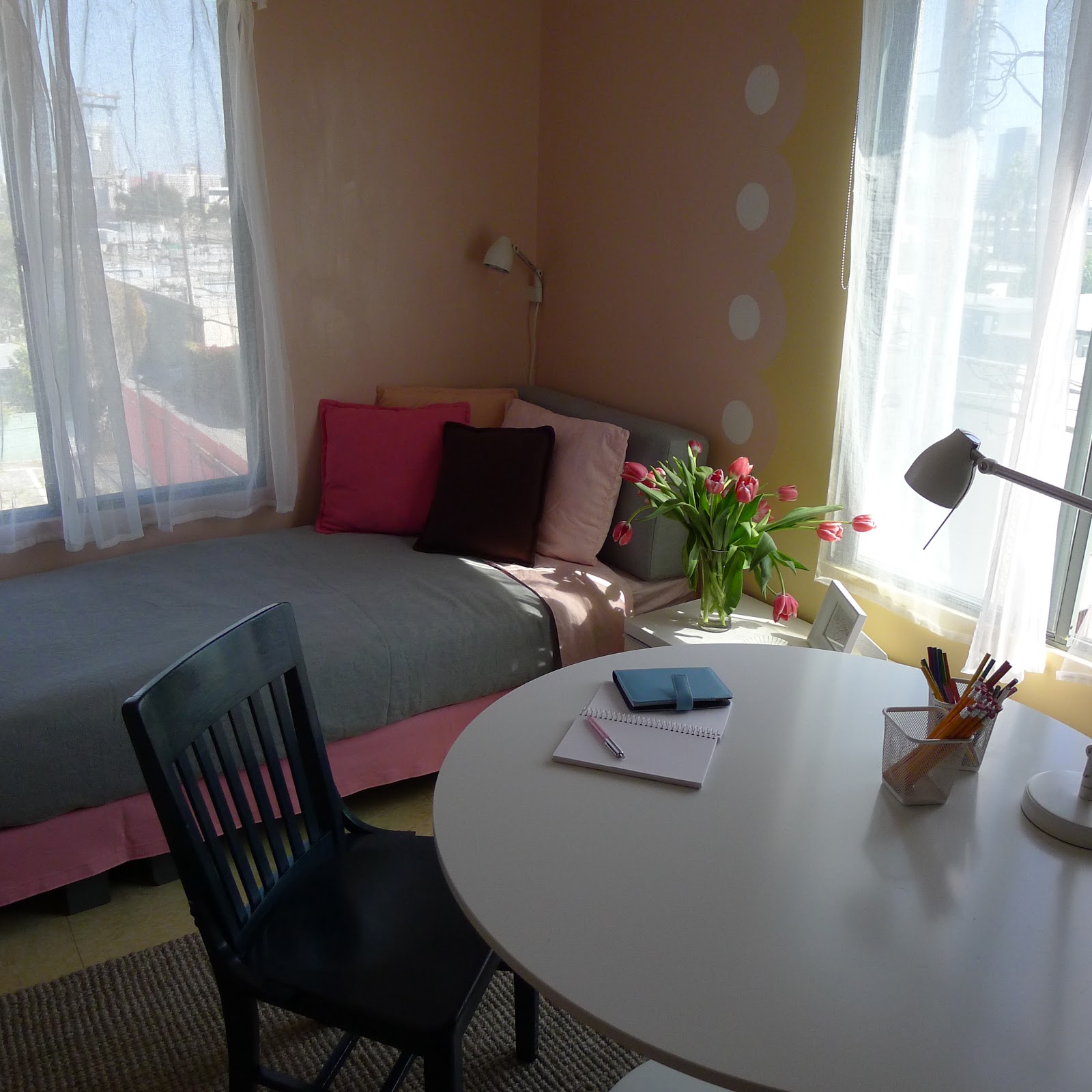
Above: This view shows the entry/dressing area on the left, as well as the seating area on the other side of the dividing curtain. We weren't allowed to attach to the ceiling, so the curtain is cantilevered off the wall. The dresser is vintage. The wall colors are used in an architectural way to define the functions of the room, and to enlarge the sense of possibility in one room. At the Open House, many people let me know that it felt like an apartment, which was great feedback for me, as the whole room (without sink and closet) is only 11' x 12'-9".

Above: A before photo of the long wall, that now has an entry/dressing area, dresser, divider/curtain, chair, side table and banquette.

Above: I painted this circle on the wall to use as a focal point, kind of the way a fireplace can focus a room. It also reminds me of the moon and the sun. I wanted the art to be integral to the room, an actual part of the room, and to be large scale, so this was a way of achieving those things. The chair is a very lucky find...it was donated to me by my friend Maria. When I told Maria about the project she said she might have a chair for me...little did I know how absolutely perfect a chair it was! It's tiny in scale and really comfortable, as well as a very appealing design. The "Martini" table is from West Elm, as is the seagrass rug. The lamp is from IKEA, part of the Tral Series used throughout the room...ceiling fixture, wall lamp, and desk lamp.

Above: In this view you can see the vertical line of white circles I painted on the wall. I was channelling Vanessa Bell of the Bloomsbury group in thinking about this room, but I wanted to take the circle theme in a more modern direction, so I made them hard edged, less painterly than she would have made them. The table/desk is the "Docksta" from IKEA. The chair was from my garage, painted a glossy Farrow & Ball Hague Blue. The credenza is "Besta Burs" from IKEA. The color changes from soft peach to creamy yellow as the room moves from sleeping area to working area. I wanted to include the creamy yellow in my palette, as it was the color of the vinyl flooring, something we couldn't change.
Photo Credit: Laure Joliet

Above: The view of the same corner before the work was done.

Above: I had a platform built in two sections so that it would fit in my car and in the elevator. I covered it with a painted drop cloth, and put the existing mattress on it, as well as a sofa cushion to fill out the remaining length of the wall, thereby creating a window seat (my personal obsession) as well as allowing for a bed to sleep in and a sofa area, to enlarge the sense of what the room could be. The areas are defined by the bold pink in the seating area and the soft peach in the sleeping area. My upholsterer, Angie's Custom Upholstery, made and donated the extra cushion, and the bolsters, as well as the bedcover and pillows.

Photo Credit: Laure Joliet
Above: The view is really interesting...a lot to look at. I wanted to celebrate the windows, not cover them up too much, just soften them. Having blackout covering was a requirement, so the valance I made covers an opaque roller blind my drapery workroom donated and installed.

Above: One thing we couldn't change were the dark brown powder coated door frames. In order for them to disappear, I painted the surrounding wall the same dark brown color. Another requirement was to have a bulletin board. Between the window and the corner is a bulletin board made from magnetic paint. At least 3 coats are needed to make it magnetic enough, and it comes in charcoal grey. The credenza doubles as a night table and desk storage. Because of the low sill I wanted to keep the writing surface away from the wall so as not to block the window.

Above: This is the same corner before I worked on it.

Above: A round mirror from IKEA over the sink reflects the whole room.


Above: My friend Elle helped me with the room. Among other things she helped me to put the IKEA cabinet together, which wasn't an easy thing to do!
When I started thinking about this project I decided to rely on design, and a limited budget, rather than rely on expensive donations. I wanted to make a place that could be re-created by someone who might use this room, something that would be achievable with very little money. There is something about working on a space that connects you to it in a deeper way...I certainly enjoyed the time I spent there, and I enjoyed getting to know the woman who's living in this room, as well as all the other designers. The two Vanessas are planning to organize more of these projects in the future which I look forward to being a part of.